SINGAPORE
MARATHON
Some brands want a simple refresh to stay relevant. But the Singapore International Marathon needed a rebuild.
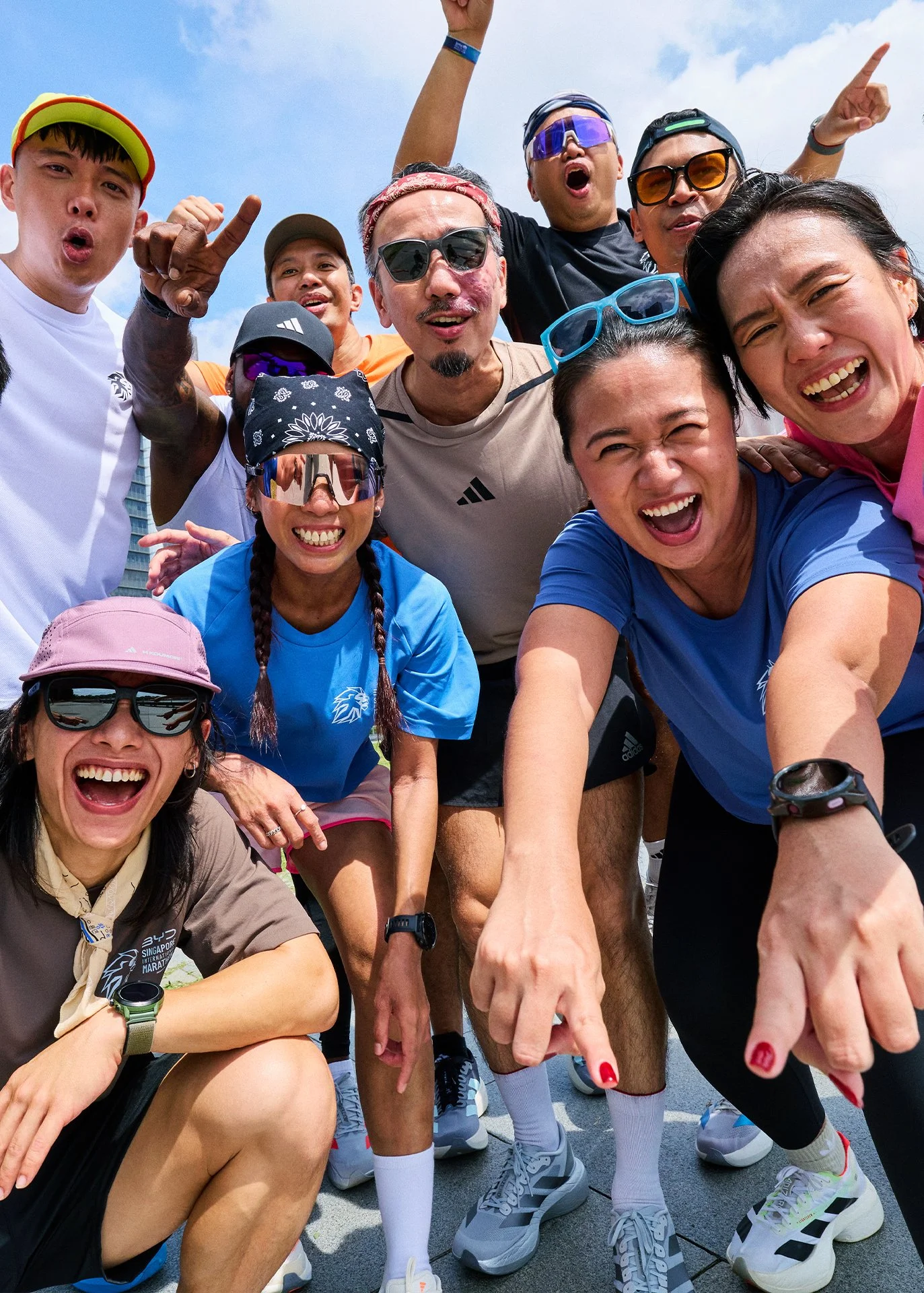
After 44 years, it had become more than a race. It was a date marked on the nation’s calendar and in the hearts of tens of thousands of runners.
Yet its true stature as Singapore’s only national marathon and Southeast Asia’s only World Athletics Gold Label Road Race wasn’t reflected in how it looked or spoke.
That’s when we knew that familiarity had become its ceiling.
Project Date - 2026
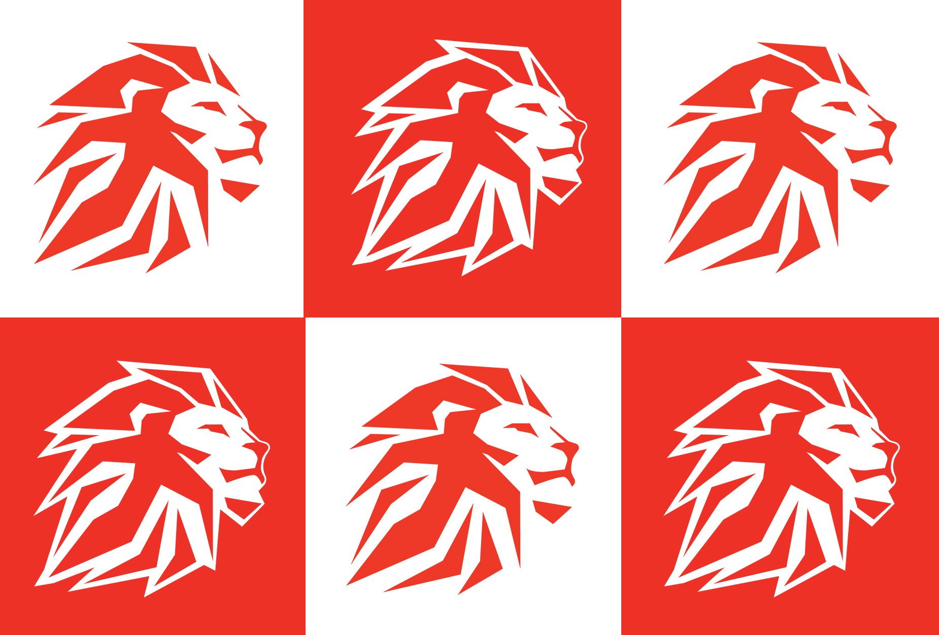
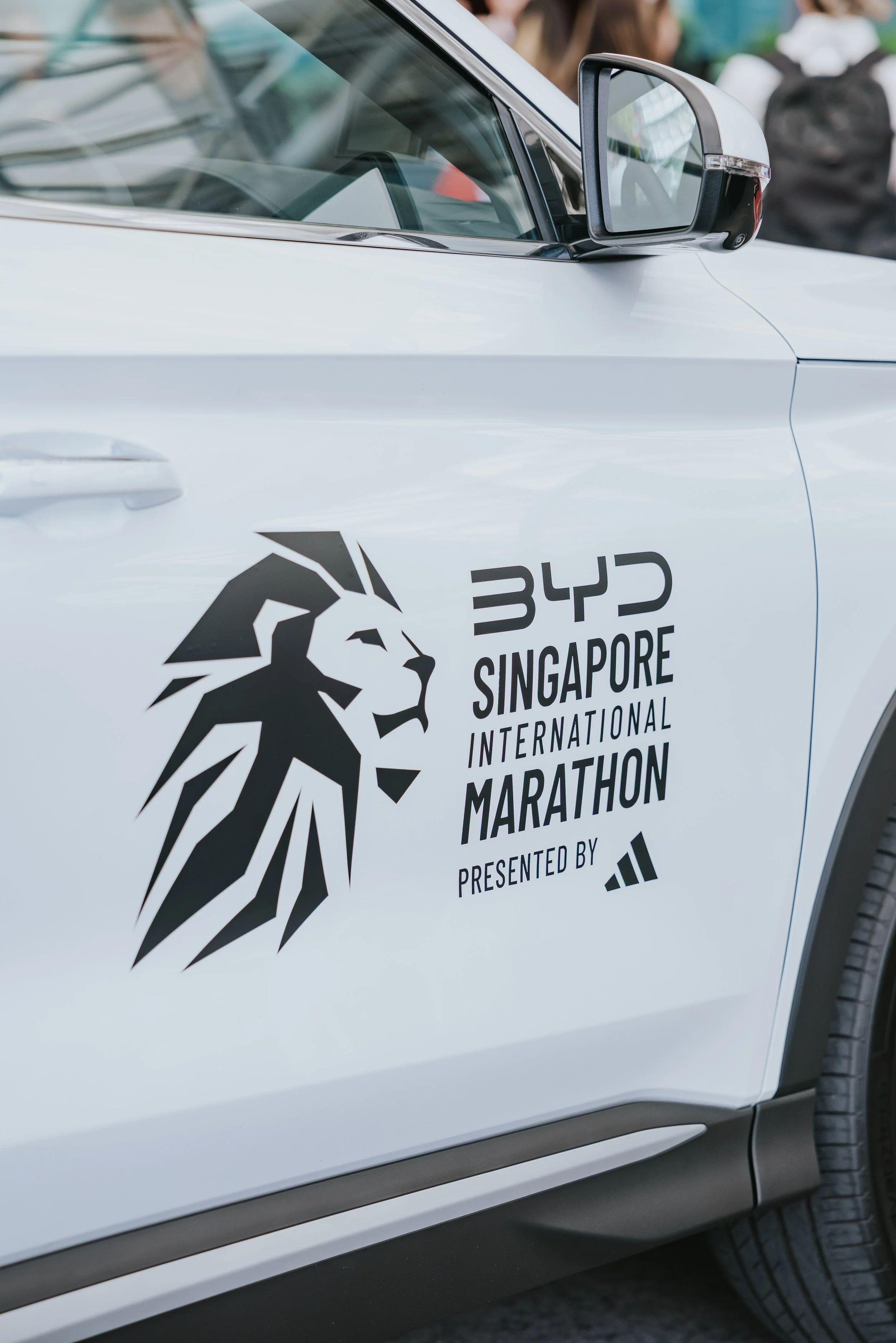
The logo was the hardest thing to get right, and the most important. We needed a symbol that could carry 44 editions of history while feeling unmistakably new.
We found it in the Merdeka Lions — Singapore's iconic stone lions that embody courage, strength, and national pride. We took that form and wove something unexpected into it: a runner's silhouette within the lion's mane. Two identities merged into one. Singapore and the marathon, inseparable.
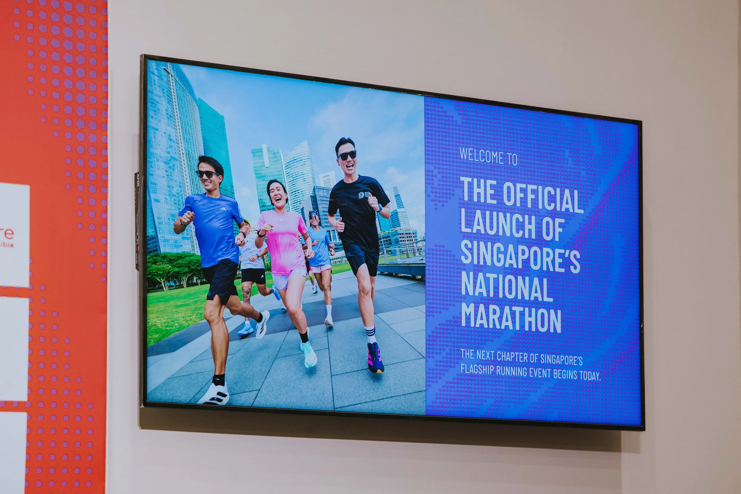
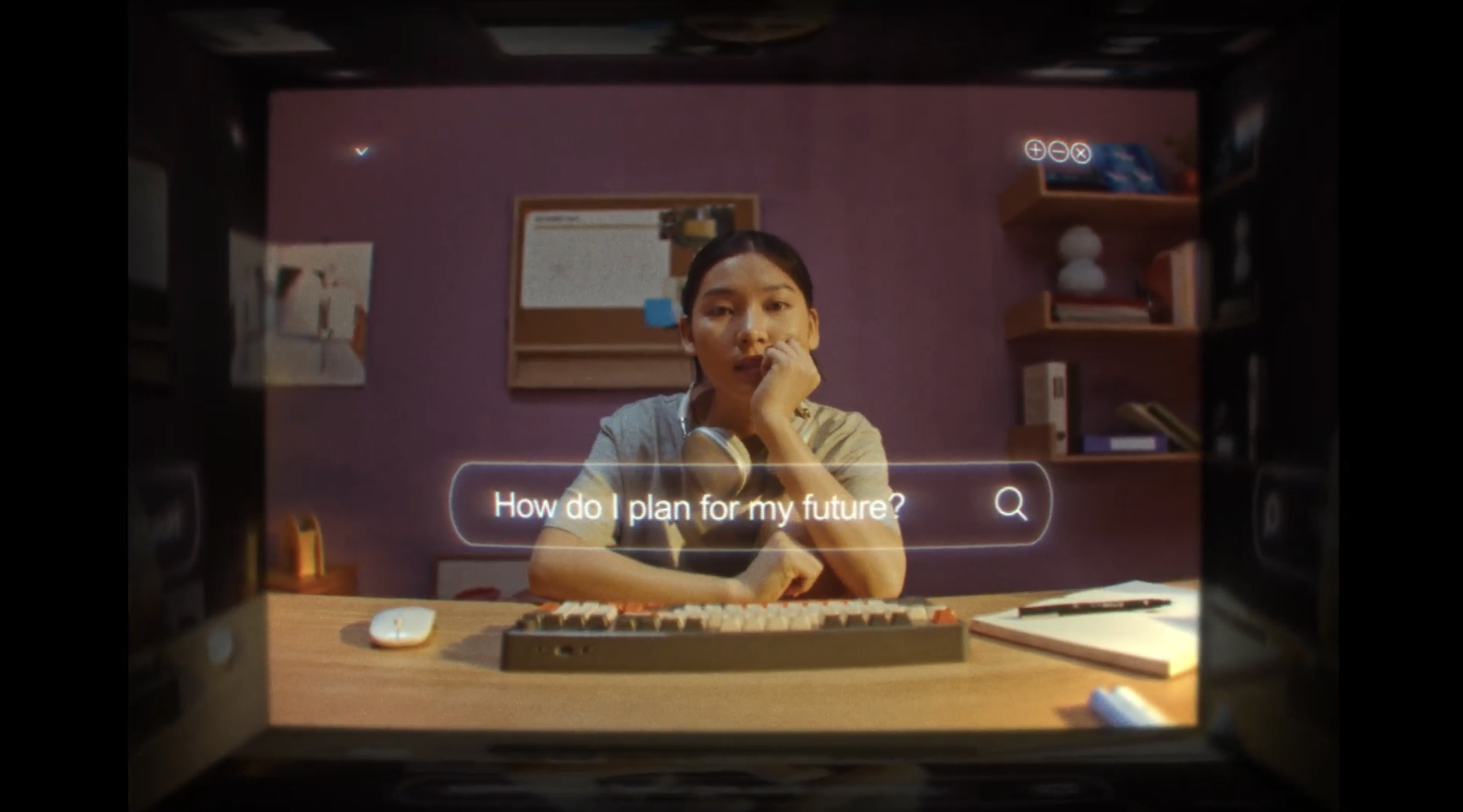
Proven in Sweat. Powered by SpiritWe made a film. Not a hype reel — a quiet, honest letter to Singapore's running community. It named the heat, the humidity, the same roads week after week, and turned them into reasons to keep going. It gave the rebrand its emotional core, and the race a voice that finally matched its soul.
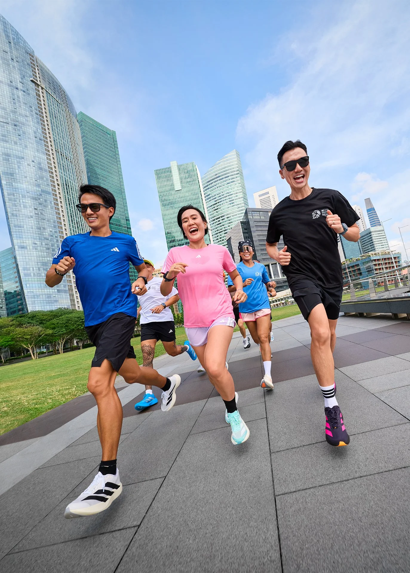
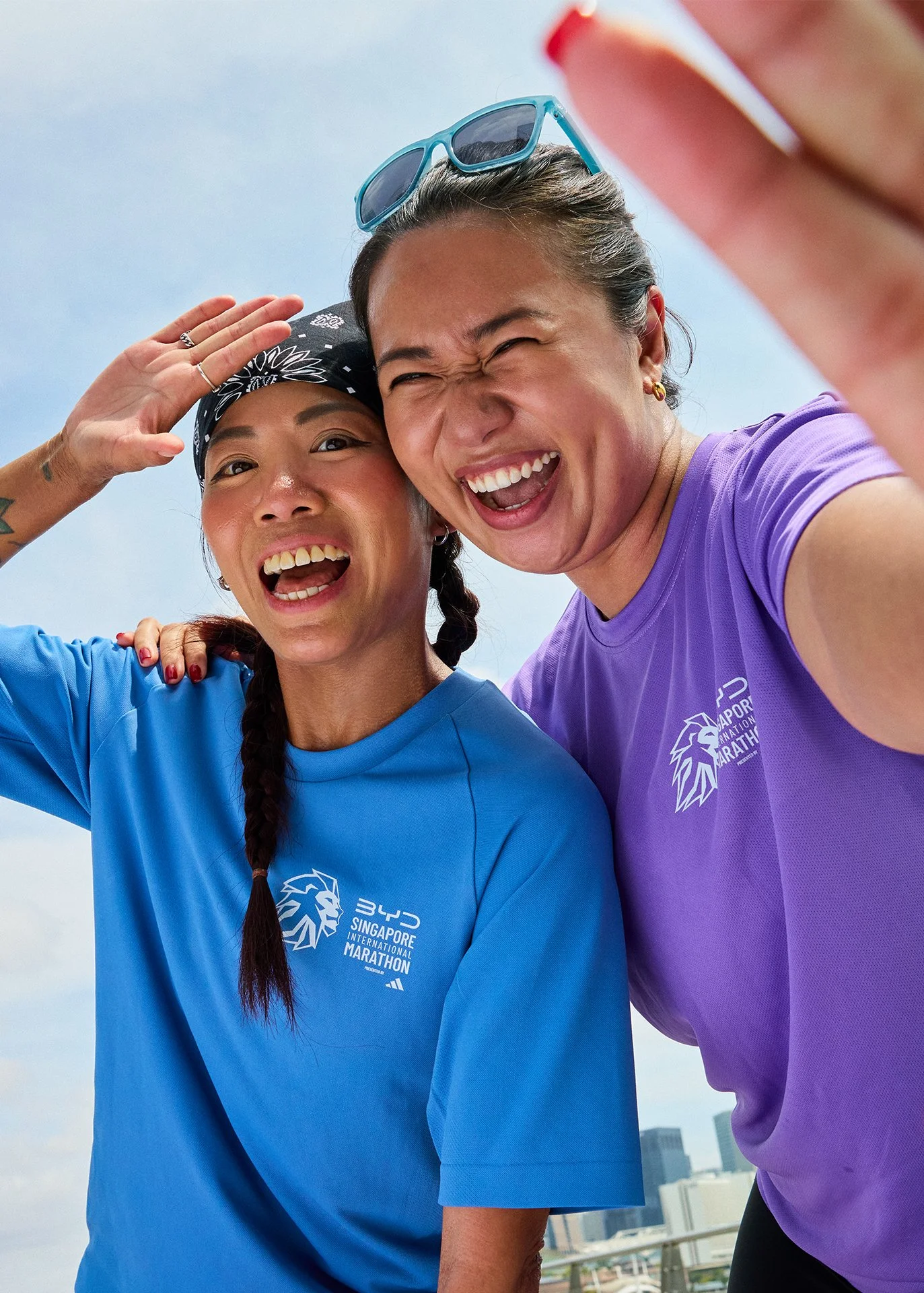
Key Visuals


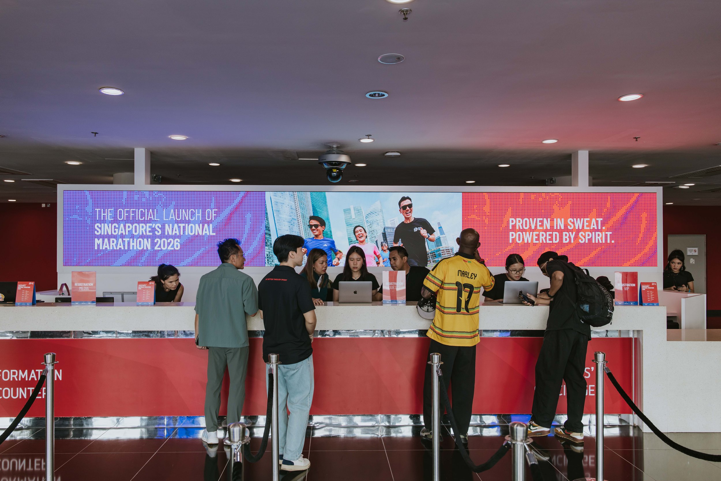
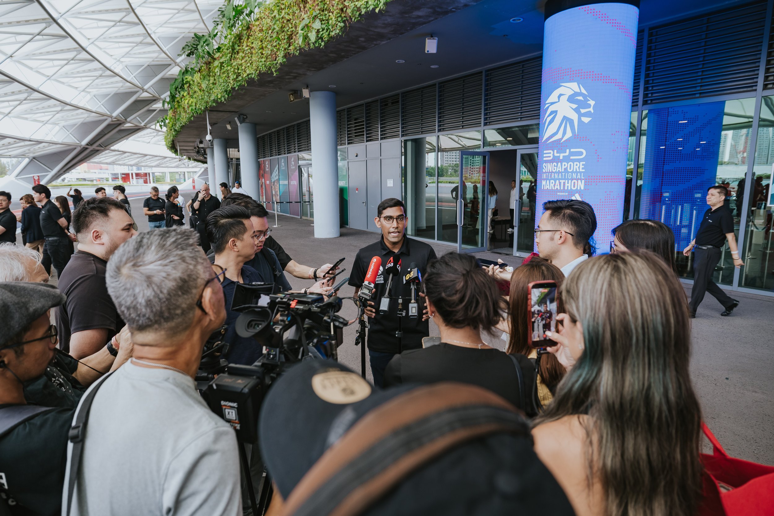
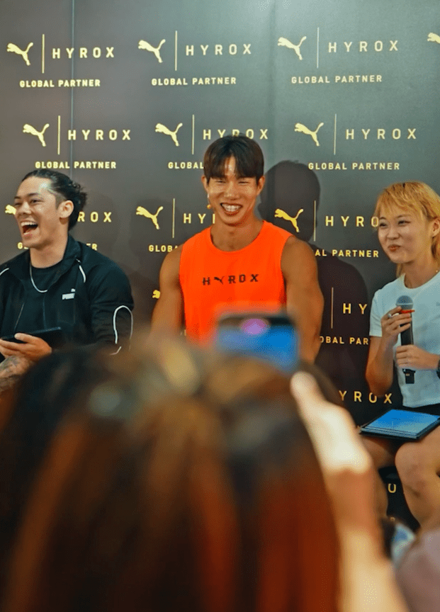
Press Conference
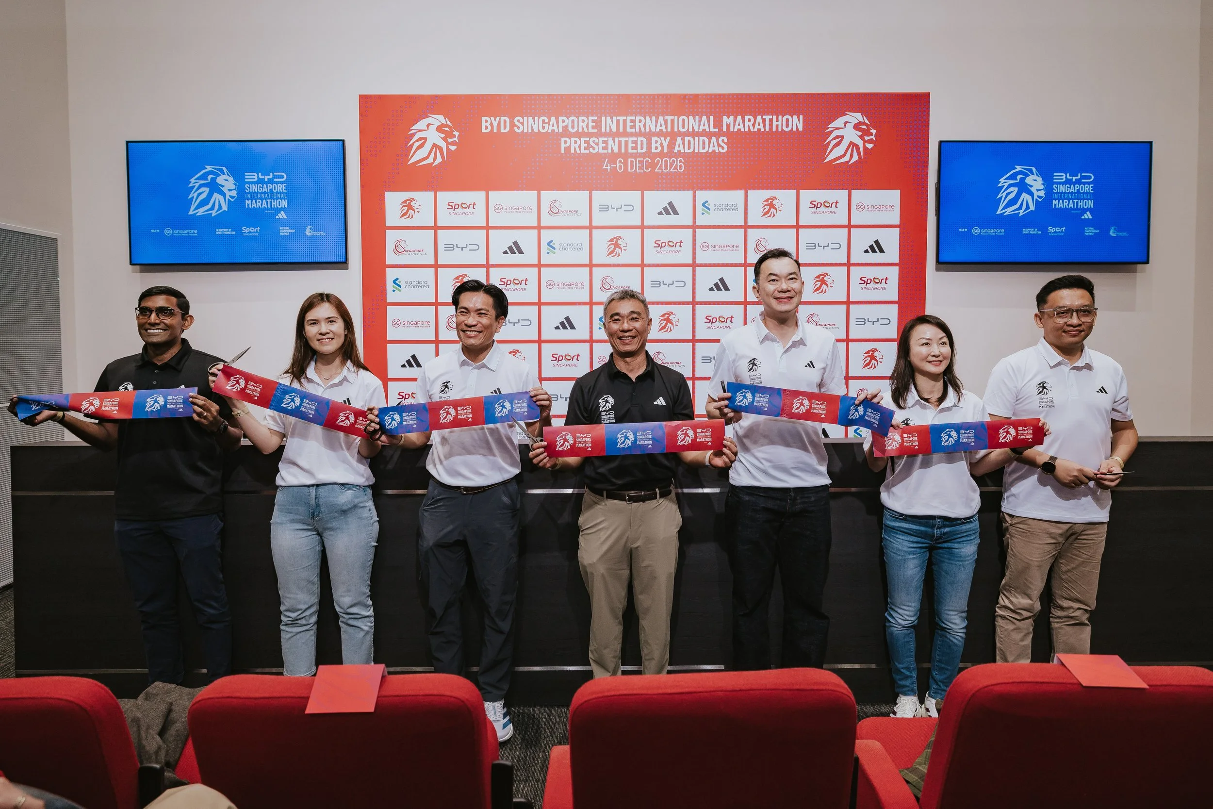
The moment the rebrand went public. At the official press launch of the Singapore International Marathon, our new logo and brand identity made their world debut, unveiled in front of media, partners, and the running community for the very first time.